INDUSTRY TRENDS
Make it Pop! Understanding How A Graphic Designer Uses Color
March 18, 2020 | WRITTEN BY: Carmen
Written by: Creative Designer, Louis Marchand
Have you ever seen an advertisement that stops you in your tracks to read more? Have you ever been captivated by a piece of art for hours? Or maybe you’ve simply walked into a room only to have your breath stolen by the visual treasure before you. In this case, you’ve most likely witnessed a strong and intentional use of color.

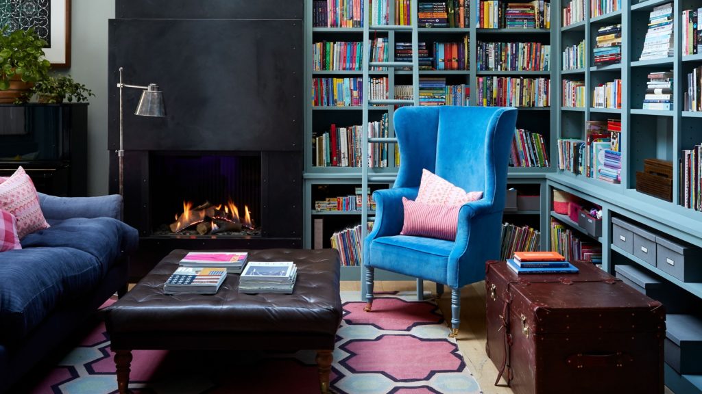
Color is a visual element that we often take for granted. So many times, in everyday decision making, color is reduced to how we personally feel about it. While there are psychological reasons to explain some of those feelings, choosing a color in any design is far from arbitrary. Art and design deviate from one another when choices are ordered versus when they are based on personal whims and wishes. Put simply, art is instinctive and allows for arbitration, whereas design is more precise.
Understanding the design significance of choosing a color is the first step in understanding a small ingredient of the secret sauce that makes good design. The second step is color theory. Common knowledge includes knowing the primary colors of red, blue and yellow and what those colors make when mixed. This is just the tip of the iceberg. Next, you’ll delve into tertiary and complementary colors, analogous and monochromatic schemes, tints and shades, values and hues – everything revealed by the color wheel. The color wheel is the greatest tool in understanding the ROY G BIV spectrum– the proper color order of red, orange, yellow, green, blue, indigo (blue-violet) and violet. Once a designer absorbs the color wheel into their design process as second nature, creating color options becomes a much easier and efficient task.
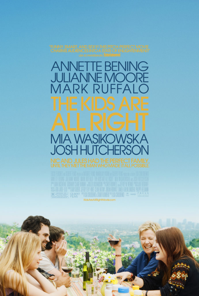
Marketing involves a whole other set of guides that can transform a good design into an effective design. Color psychology studies color as a mode of communication with human behavior. Understanding how the brain generally responds to color can be a powerful tool in marketing a product or service. Try this: Imagine using fire-engine red in any way, shape or form at a spa. It would create such a chaotic environment, how could anyone focus or relax?
Let’s take moment to break down Environmental Design Group’s brand colors, Dark Blue and Moss Green.
- Blue as a color is often associated with calming abilities that can suggest trust and loyalty. In addition, dark blue can suggest intelligence. A firm employing numerous landscape architects and engineers would want this association. Appearing in nature, blue can be found in rivers and lakes – the “color” of water. Environmental Design Group has a profound relationship with water as many of our service lines, like Water Resources, Environmental, Green Infrastructure, and Landscape Architecture, involve preserving this natural resource. The association of our blue to intelligence, trust and water is not an accident.
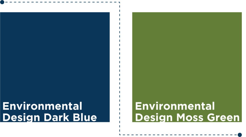
- The color of grass and trees, green is most often associated first with nature. Nature and sustainability are two of the foundational elements that are part of every project that Environmental Design Group innovates. The color can also suggest harmony and rest, as well as new growth – all essential in creating Happy Healthy Places for our clients.
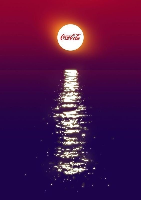
The depth and breadth of color theory and color psychology fill textbooks and sustain academic fields, yet these are tools that designers use every day in the projects they produce. We don’t choose red just because it’ll “pop”, we’ll choose red if we want our audience’s attention to be grabbed, almost aggressively, by a message that could suggest urgency or something bold. The truth is that any color can pop off a page and any color can become white space and fill the background. Understanding why and how to use color for your audience is just one of the essential puzzle pieces in every great design.
RELATED TAGS:
[xyz-ips snippet=”comment-form”]


