Conversation with the Designer: Director of EDG Creative, Dave Berman
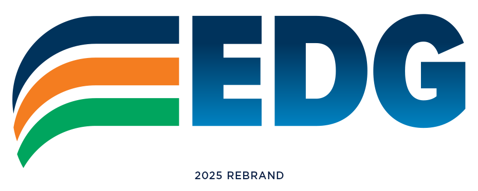
Environmental Design Group launched its new logo in July 2025. We took a moment to chat with designer, Director of EDG Creative, Dave Berman, to learn a little bit about what drove the logo redesign and how he, as a creative, works through the process.

Almost immediately upon hire, you were tasked with leading the company brand refresh. What are your typical first steps?
I like to channel my inner six-year-old and ask ALL the questions
- Why are we doing this?
- Why now?
- Who is our target audience?
- What’s your favorite color?
- What’s your least favorite color?
- If your brand were a Muppet, which Muppet would it be?
After gathering feedback, I sift through it all, look for themes and take time to load up my arsenal of inspiration.
We’ve heard you speak of the “sandbox.” What exactly is that, and how does it figure into your process?
Sandbox, playground, my mess, the terms can be used interchangeably, and the space serves as a place where I gather all my thoughts, no matter how out there they might be, to find what truly inspires me. It’s rare that I have one solid idea from the start that makes its way through the gauntlet of design review and becomes the final brand. After initial information gathering it’s all about playful ideation – doodling in a sketchbook, tearing up magazines, folding paper, scanning in concepts.
At this point nothing is “wrong”, there are no dumb ideas, no such thing as too much and every variation brings something new to the table. As a self-proclaimed hoarder of ideas, the sandbox is a place where I can save every concept from the first iteration to the one hundredth so that if I realize the first contained gold, I can still get my hands on it.
From the sandbox I am usually able to draw at least 4-6 solid concepts to move forward. Depending on if it is an internal or external client, I sometimes share what landed on the cutting room floor. Regarding EDG’s rebrand, it was a very collaborative effort, so I willingly shared my many inspirations and asked for feedback that led to the final design.
What about EDG’s services inspired you as you considered the new look of the brand?
What EDG does was hugely inspirational to me in the creation of this mark. I began by interviewing staff at all levels of the company which resulted in my greater understanding of the passion that the company has for placemaking, how people interact with the spaces we create, and helping communities feel inspired and at home.
The new logo is bold and colorful. Can you describe why you chose the colors that you did? We note that you kept Environmental Design Group’s historic navy. Was this intentional, and how did that affect the updates to the green and the introduction of the orange?
It was important that this new brand bring a more modern and engaging flair, however, equally important was not throwing away the past that got us to where we are today. With that in mind, it was decided that we retain the legacy navy blue as the most prominent color – solid, steadfast, experienced – and add in a brighter blue gradient to add a sense of transformation and newness.
For quite some time, EDG had utilized a two-color logo, blue and green, but we wanted to add a third color to showcase the company’s creativity, energy, and passion. The green evolved from the previous green which seemed a bit dated and needed a refresh and we pulled in bright orange as a secondary color to show that spark of creativity.
All three colors appear in nature. Blue for water and sky, green for trees and plants, and orange to represent the horizon but also appear in our everyday environments – construction zones, bike paths, water distribution, roadways, etc. and represent the places we create and the spaces where we work.
We have been so excited to follow you as you’ve moved our brand to its next chapter. What message do you hope it conveys to our communities, both internal and external?
If you look at the logo, the icon at the left conveys movement and forward motion, which is something EDG is continually pursuing. The three lines appear as steps to represent where we’ve been and the progress we have made, and the overall look is intentionally clean to highlight EDG’s clear path: a beginning and middle, leading to an exciting new chapter that is innovative and bold.
AEC Marketing and Branding with EDG Creative
EDG Creative’s thoughtful approach to branding highlights how intentional design make a meaningful impact. Our work in AEC marketing helps architecture, engineering, and construction companies tell their story with both clarity and creativity. If you’re ready to elevate your brand and connect more deeply with your audience, contact us to learn how EDG Creative can help guide your next chapter.